For 2016, the big surprise was that Pantone chose not one but two colours of the year. Rose Quartz and Serenity was the pale pastel colour-combination that complement each other naturally.
The trend for blush tones was set and we have seen these colours appearing everywhere.
Designers have kept a close watch for months on which direction the Pantone colour trend is going for 2017. In previous years, the Pantone Color Institute often made a bold choice (we're thinking about Radiant Orchid in 2014 or Tangerine Orange in 2012).
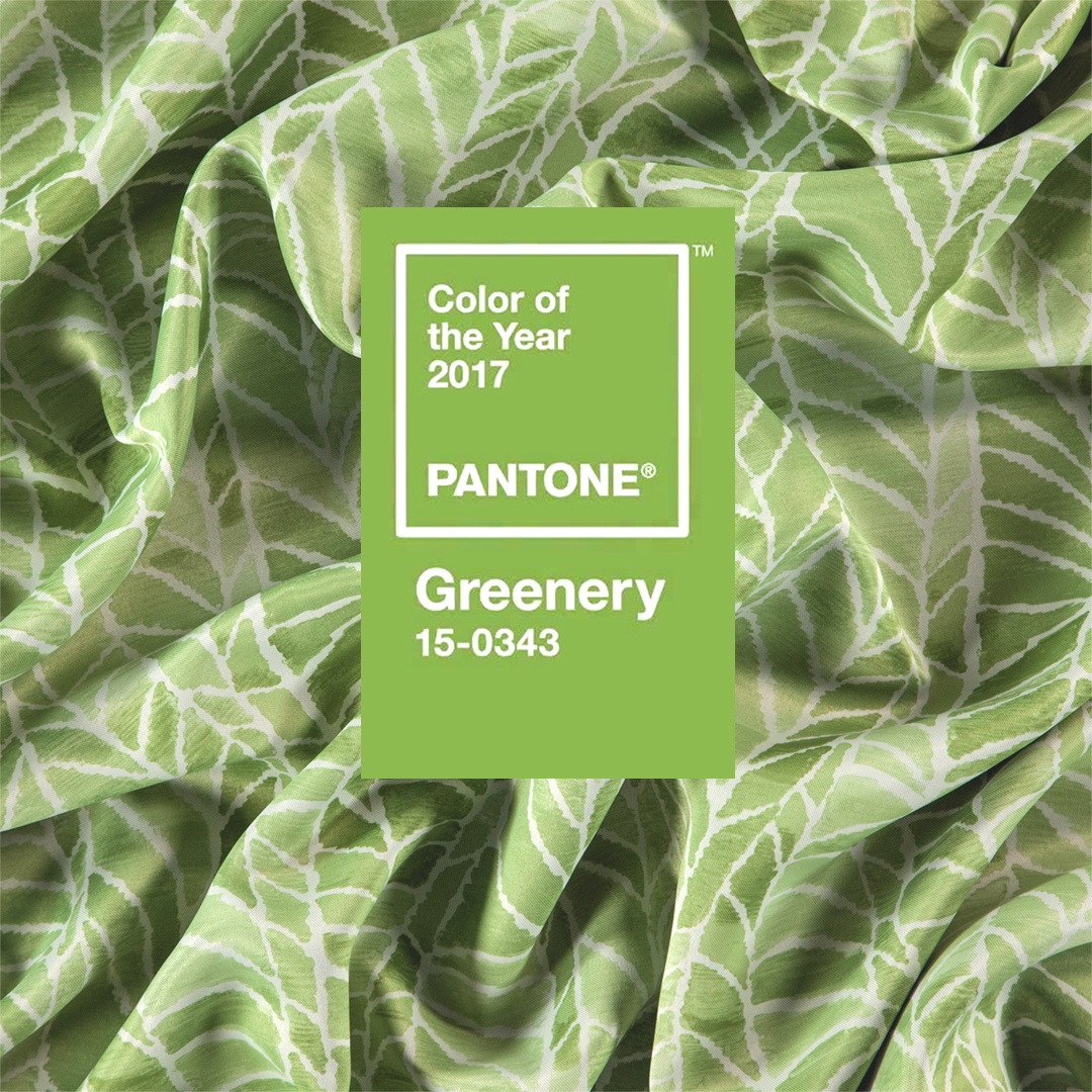
The colour trend for 2017: Greenery. It is a vibrant color that brings a sense of spring.
Green is the shade of nature. It's the start of something new.
It is fresh and positive and gives a feeling of health.
“This particular green is an unusual colour: a combination of yellow and blue, or warmth and a certain coolness’, said Pantone’s executive director Leatrice Eiseman in her press release. “Greenery symbolises the re-connection we seek with nature, one another and a larger purpose.”
We already saw lots of plants and greenery popping up in home décor in recent years, and now the colour of the year will reflect the trend of bringing the outside inside.
Designing everything with the specific Greenery shade may be a bit overwhelming, but you can always start with bringing some accents into the room interior with our "ginevra" design from the dim-out collection Gossian. Check out the rest of Gossian here, and stay tuned for more interior design inspiration.
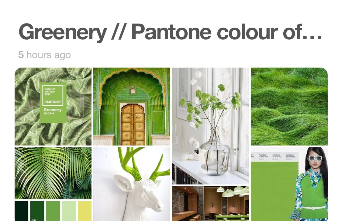
Discover the FR-One Greenery Pinterest board: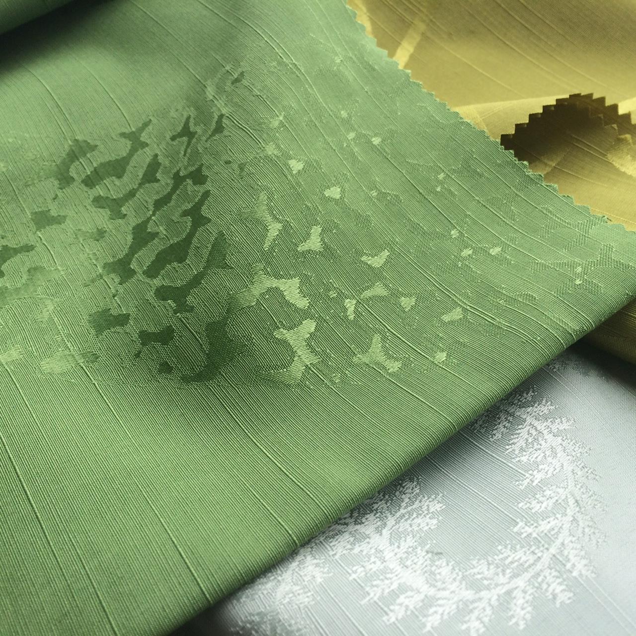