-1.jpg)
What if you want to work with blue tones though as well as plum?
We’re here to tell you, it can be done. You don’t have to work with a quirky, eclectic style to make these complementary colours work in an interior: all spaces including hotels lobbies, healthcare settings and restaurants can be invigorated with thoughtfully refined styling.
From pastel blue paired with lavender accents, to uncompromisingly moody sea tones matched with deep plum, purple and blue are the friends you never knew your interiors needed.
.jpg)
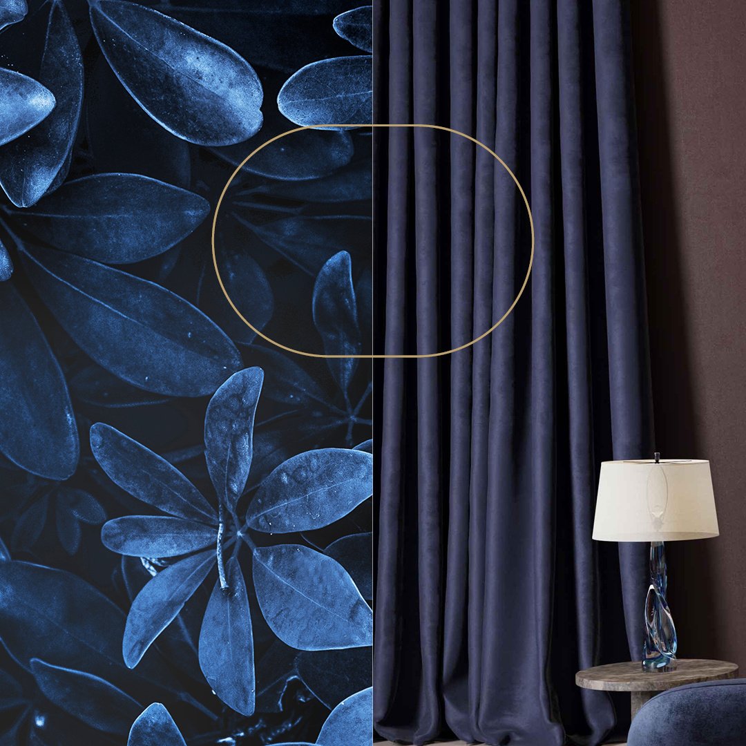
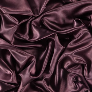
Plum is a rich and opulent colour that adds depth and a luxurious feel to your design scheme.
Discover this great colour match in the collections of FR-One, like the dim out series Ataton, which offers fabrics that are matte or have a little shine to them. Another dim out fabric that’s perfect to offset metallic accents (because whose luxurious interior doesn’t include at least some shine?) is the aptly named Blueberry. Here they are below, side by side:
-3.jpg?width=300&name=large%20(1)-3.jpg)
-2.jpg?width=300&name=large%20(2)-2.jpg)
Something else that royalty throughout the centuries have loved is velvet. It looks delectable, it feels amazing, and it creates instant drama.
This textured velvet in a damask pattern from the Grandioso collection exudes luxury and style.
-1.jpg?width=940&name=Untitled%20design%20(6)-1.jpg)
-1.jpg?width=300&name=Untitled%20design%20(7)-1.jpg)
Check out the gorgeous jewel-tones of blue and purple in this fabulous den styled and owned by vintage jewellery specialist and decorator, Alisa Bloom.
Vamping up the colour
Combining textured and plain velvets, dim out fabrics and sheers, you see here a selection from The FR-One 'gioia', 'masilk', 'gaspeite' and 'kavalier' designs.
“ Gioia” (pronounced joy-ah) is a precious metallic embossed design.
This dim out design has some striking colour in its range like this plum.
Dare to be strong in your colour choice and add a lustre for an ultra-sophisticated feel.
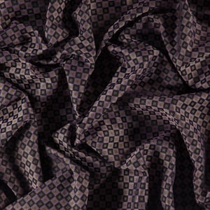 The Genii collection has a series of exceptional fabrics with both upholstery and drapery qualities.
With small geometric patterns inspired by neckties motives.
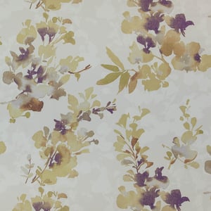 A softer way to bring purple tones in your interior is by using it in a pattern, like this fabulous floral design with watercolour effect from the Gossian collection.
It's the first time in the FR-One collections that we have introduced a patterned dim out fabric.