In the Far East, in particular, there has been a real move towards dedicated kids' cafés featuring innovative designs that appeal directly to their core clientele. Think candy-coloured play castles and pastel ball pits set within stylish café surroundings. And with parents becoming increasingly aware of the impact of screen time on their children's lives, they are now more willing than ever to invest in family-orientated experiences away from the home.
In this blog post, we look at this exciting growth area for architects and interior designers and sum up the key factors to consider when designing commercial spaces with children in mind.
 Make it visually appealing
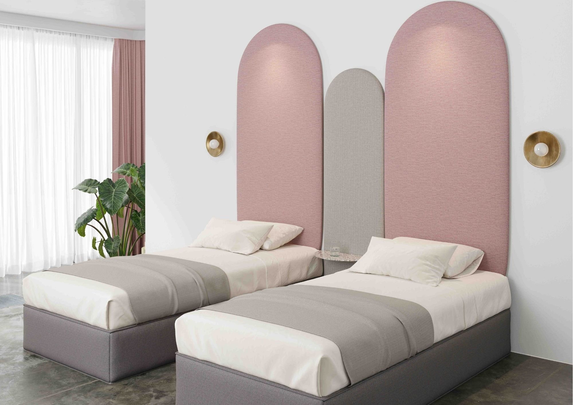
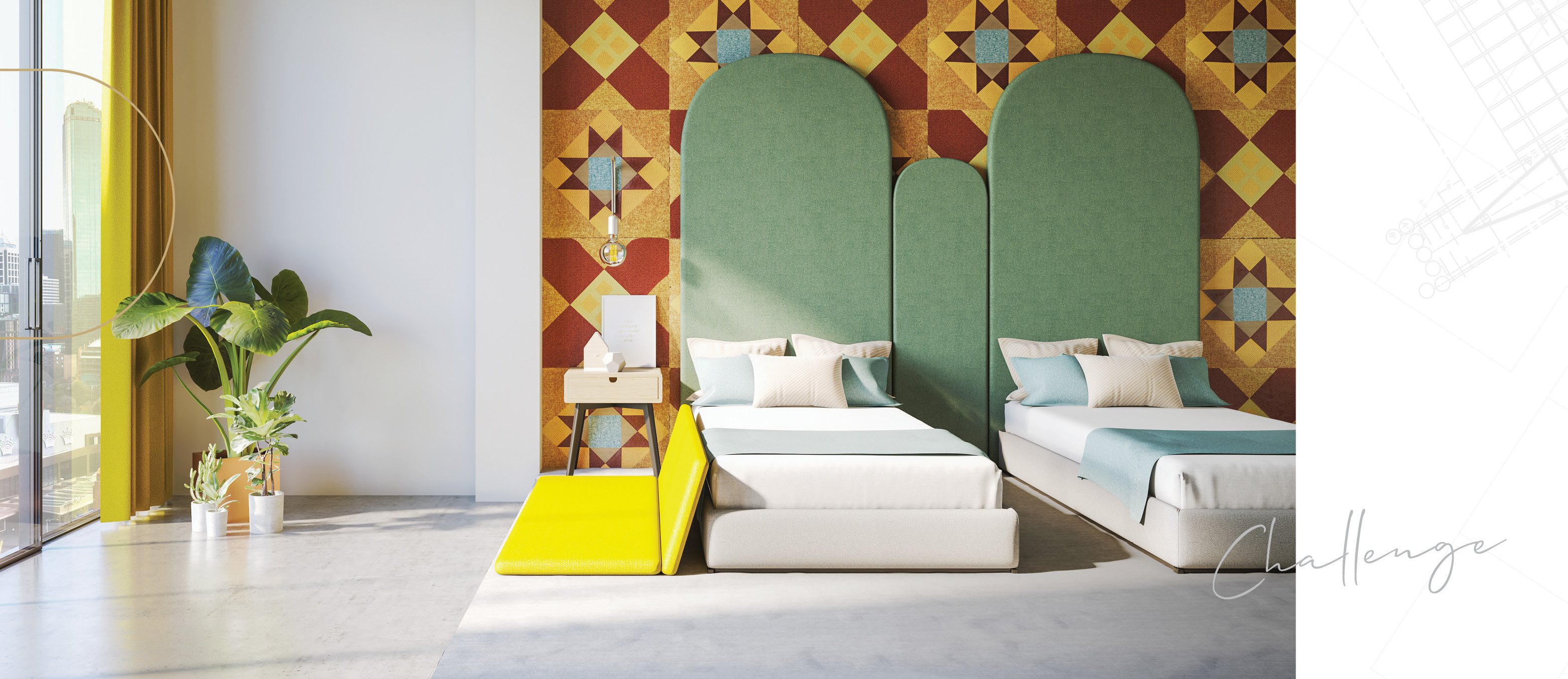
It may sound obvious, but to make a restaurant, café or hotel attractive to little ones you need to ensure your design appeals directly to them. Bright colours and interesting textures are known to appeal to children, as are elements that really fire up their imagination such as animal motifs and jungle designs.
It's also worth trying to see the world through a child's eyes when planning your design. What will the space look like if you're only three feet tall, for example? Put yourself in their shoes and the end result is much more likely to hit the mark.
At Lolly-Laputan, a self-declared 'premium kids’ café' in Dalian, China, the imaginative design has been inspired by the idea of a 'dream fairyland'. Created by architectural design studio, Wutopia Lab, this innovative project features a 'forest of lights' made from 1,000 acrylic tubes simulating the effect of sunlight shining through a forest canopy. And in the stunning main café area, kids can explore 'Cloudy Town' in which tree-houses, slides and a carousel are hidden among white acrylic 'clouds'.
Keep it practical
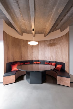
A family-friendly commercial space needs to be practical as well as visually appealing. After all, you can't trust kids not to spill food and drink, so any materials chosen need to be as durable and as easy to clean as possible. A hard-wearing floor such as timber or vinyl is a good choice, as is a durable, wipe-clean surface for upholstered seating areas. FR-One's faux leather Mythic range comes in a wide variety of colours and conforms to all necessary safety standards thanks to its inherently fire-retardant properties.
It's also worth thinking about making your child-friendly space as adaptable and flexible as possible to accommodate different types of family groups. In the case of a restaurant, this might mean designing tables and seating which can easily be moved around as required to meet the needs of both large and small groups of diners. And it's also important to ensure that your seating is comfortable for all your customers - however small or large they may be!
.jpg?width=2000&name=019_001_optimum_inside_29%20(1).jpg)
Don't forget about the grown-ups!
Yes, you're designing a space with children in mind, but don't forget that the adults are the ones paying the bill! If the space appeals to grown-ups as well as to kids, they'll choose to return as a family time and time again. It's all about getting the balance right.
In the case of a new children's restaurant in Dubai called 'White and The Bear', the design team have eschewed primary colours – instead opting for a neutral, calming palette. The philosophy behind the predominantly white interior is that it stops its young visitors from becoming overstimulated. Created via a partnership between British child nutrition supremo Annabel Karmel and architects Sneha Divias Atelier, the restaurant features play areas, a dining space and a dedicated retail zone on the first floor.
The other benefit of this minimal design is that it is more likely to appeal to adults as well as kids. An antidote to brightly-coloured children's venues, White and The Bear is leading the way in terms of innovative, child-centred commercial design. And this carefully-crafted aesthetic may be just what tired parents are looking for when they want to switch off the technology and reconnect with their kids.
If you found this article useful, please share it online and spread the word!

.jpg?width=300&name=Mood_06%20(2).jpg)
.jpg?width=300&name=Mood_06%20(4).jpg)
.jpg?width=300&name=Mood_06%20(1).jpg)
.jpg?width=300&name=Mood_06%20(3).jpg)

